| Product / Service: | Fundraising Consultation |  |
| Size of Company: | Sole entrepreneur | |
| Year Founded: | 2008 | |
| Website: | www.tripointfundraising.com |
Amy Eisenstein, a certified fundraising consultant, enjoyed a great deal of success even before she contacted me. But she knew she could be doing more on the web to grow her business. She was right! Now her business is able to soar both online and offline, and her reach has never been greater.
Amy’s Success with Smart Web Design*
I spent about six weeks researching Amy’s market, building her new website and perfecting her brand image. Her site launched in mid-November 2010. Within a couple of months, she was already enjoying some significant increases in her business:
- Web traffic increased by more than 800%
- The number of board retreats Amy was hired to facilitate quadrupled
- Weekly email list subscribers rose by more than 30%
- Amy got her largest client yet, a $25K account
- The number of registrants in Amy’s eClass tripled
- Amy’s booked speaking engagements doubled
- Amy went from 0 to hundreds of Twitter followers in less than 3 months
*Expecting to see “Results not typical” here?
While results do vary, Amy’s success is quite typical of my smart web design process.
Ready to take your business to the next level?
Below, read how I helped Amy grow her business.
A Whole New Amy Eisenstein
The first thing I do with any client is take a good look at their branding. Good branding is the foundation of effective marketing. So before diving into building Amy’s new site, we worked together on improving her brand’s image and message.
Changing Amy’s Business Name and Logo
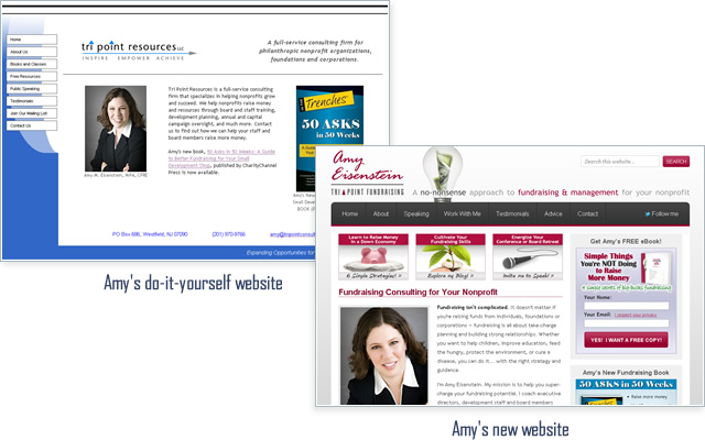
Originally Amy dubbed her business Tri Point Resources. The “Tri” was reinforced by three benefits in her tagline: Inspire, Empower, Achieve. Unfortunately neither her business name nor her tagline suggested what she actually did for her clients. So there was my first challenge.
She’d already become known to people on her list as “Tri Point.” She was concerned that dropping the name might hurt her recognition. I agreed. So I suggested changing it to Tri Point Fundraising to retain the most memorable piece of her name and clarify her target market.
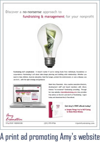
But I knew that wouldn’t be enough. What Amy didn’t realize was that she already had another brand name — her own name! Her new book was written by Amy Eisenstein. She was introduced at speaking events as Amy Eisenstein. I felt it was more important to place the emphasis on her name rather than Tri Point. So I designed a new logo that kept Tri Point intact while promoting Amy Eisenstein above all else. I also advised changing her brand colors to help her stand apart from the competition.

Communicating Amy’s Brand Essence
As I reworked Amy’s brand image, I also analyzed her brand essence. What was her message? What was it about Amy that would drive people to hire her over her competitors? Amy and I discussed this at length. In the end, we decided it was her “no-nonsense” approach to fundraising that gave her a leg up. So we changed her tagline to: A no-nonsense approach to fundraising & management for your nonprofit.
Branding takes time — years, not days. But as I continue to lend my design and coaching skills to Amy’s business, I have no doubt she’ll become famous for her spirited, no-nonsense consulting style.
The Result?
Amy now appears more professional to her prospective clients. Her logo and tagline reinforce what she’s all about. She’s much more memorable within a highly competitive field. And with four times the number of board retreats that Amy’s been hired to facilitate, the rebranding is definitely paying off.
The Do-It-Yourself Trap
Originally, Amy built her own website using her webhost’s site building tool. To her credit, she really didn’t do a half-bad job considering she didn’t possess any formal design or marketing training.
“After two years of owning my own business and using a “do-it-yourself” website, I decided it was time to hire a professional and get a “real” website. I was ready to take my business to the next level, and try to start selling my products and services online. A mutual friend recommended Brian. Although I thought I knew what I was getting, Brian wildly exceeded my expectations at every step of the process.”
— Amy Eisenstein
Marketing and Web Design Are Intertwined
Before I began designing Amy’s new site, I spoke at length with her about her goals. She wanted to expand her clientele on a national scale and sell more offerings online. To attract new business in her particular field, I chose to create a highly social site that showcased her passion, professionalism and vast knowledge of fundraising.
“When Brian and I started working together, we spent a significant amount of time discussing my goals. He listened and provided thoughtful feedback and suggestions. As he worked on my new site, he patiently critiqued and edited my writing and rewrote much of it to make it more client-focused.”
— Amy Eisenstein
Amy is one of the most ambitious and energetic people I know. Most do-it-yourselfers are. But as Amy learned, the do-it-yourself approach can only take you so far. There are so many nuances to web design and marketing. A single word or a poorly placed graphic could dramatically lower your sales. But conversely, great things happen when your design and marketing blend together in perfect harmony.

The Result?
With an elegant new site under her belt, Amy no longer suffers from website shame. With my regular usability and optimization tweaks, her traffic has increased by more than 800 percent. Working with a pro has brought Amy piece of mind, along with a major boom in her business.
Improving Amy’s Visibility
 After reworking Amy’s brand and building her a gorgeous new website, it was promotion time. To this end, I introduced Amy to social media and the blogosphere.
Social Media Success
I knew Twitter would be of great value to Amy. For her type of business, Twitter would offer exposure and help her build a network of fans and allies to promote her business. But Amy hadn’t ever used Twitter before, so in addition to customizing her profile page, I provided personal coaching to explain the do’s and don’ts of building her Twitter empire.
There are a variety of tricks to quickly grow a Twitter following into the thousands. And while I know these tactics, I refuse to advocate them. There’s no point. When used properly, Twitter is about building a quality network — not a quantity network. To that end, I worked with Amy to build a small, but powerful network of fans, supporters and potential clients.
Blogging for Bigger Business
Right away I knew blogging would be a great fit for Amy’s business. A blog would give her a more intimate way of connecting with potential clients. It would also serve to showcase her years of fundraising experience. Lastly, her blog would become a big part of my search engine marketing strategy, consistently putting her on Google’s radar.
I continue to review and edit each of Amy’s blog posts prior to publication. My tweaks improve her post’s pacing and readability, while optimizing the content for better search engine rankings.
The Result?
Today Amy has hundreds of quality Twitter followers who actively engage with her, retweeting her content and sharing her ideas. She’s also produced dozens of blog posts, driving traffic to her site and establishing herself as an authority in her field.
As a result of her growing network, Amy got her largest client yet — a $25K account. That’s the difference between a quality network and one filled with thousands of disengaged followers.
Amy’s Email Marketing Makeover
Updating Amy’s brand and helping to expand her social network gave me the opportunity to review her email marketing strategy. She’d already built a respectable list on her own, but there was room for improvement.
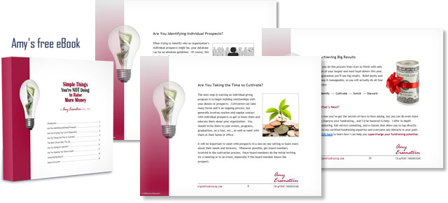
On Amy’s old website, there was no incentive for people to join her mailing list. This presented a golden opportunity for her new site. I chose to create a free eBook that visitors could download upon joining Amy’s list. In addition to providing a reason to subscribe to her list, the eBook also served to establish Amy’s authority in the field of fundraising.
Creating the Bait: Amy’s eBook
Amy emailed me an eight-page Word document that she wrote entitled, Incorporating Face-to-Face Asking into Your Fundraising Plan. She was curious how I was going to transform it into an eBook. With a little design magic and the addition of some attention-grabbing headers and graphics, I transformed her Word doc into a beautiful, highly readable 20-page eBook.

I suggested retitling the book to peak peoples’ curiosity. Eventually we settled on Simple Things You’re NOT Doing to Raise More Money. This new title does a great job of encouraging subscribers.
Overhauling Amy’s Email Newsletter
The next step was to redesign the look and feel of Amy’s email newsletter. Her new template would be consistent with her evolving brand.
I also wanted to change up Amy’s email marketing tone to something less formal and more conversational. We’d send valuable insights to her subscribers rather than constantly promoting her business. The selling would come more gently, over time, as she earned more trust and credibility from her subscribers.
“I sent out an email to my list (which Brian rewrote) and it got the best response, open rate, and click through rate of anything I’ve ever sent out.”
— Amy Eisenstein
To this day, I continue to revise Amy’s newsletters to keep their flavor just right for her growing audience.
The Result?
Currently, Amy has more than triple the number of subscribers than she did before I worked on her email marketing strategy. Furthermore, her list is more responsive and better engaged.
I’ve helped Amy grow her business in some incredible ways.
Ready to take your business to the next level?